End-to-End Banking UX
Comprehensive UX and UI redesign for iOS and Android banking apps, creating a scalable product structure validated through user testing and collaboration with internal teams. This project was completed in 2019–2020, and the design reflects the mobile patterns of that period. My focus was on structuring the product, system architecture, and creating over 200+ screens for both platforms.
00

problem
The existing mobile banking experience lacked consistency across platforms and struggled to meet growing user expectations for clarity, speed, and transparency. Multiple legacy flows — from payments to card management — had evolved independently, leading to fragmented interactions and visual inconsistencies. The challenge was to design a unified, scalable mobile banking system that would support future product growth while improving usability for both iOS and Android users.
solution
We redesigned the mobile banking experience from the ground up — building a unified UX and UI system that ensures visual and functional consistency across iOS and Android. The new structure was based on modular design principles, scalable patterns, and reusable components, making it easier to extend the product in future iterations. Collaboration with the bank’s internal UX lab played a crucial role — through usability testing, we validated navigation logic, content hierarchy, and interaction patterns. Each design decision was guided by real user feedback and test session data, resulting in measurable improvements in task completion and satisfaction rates.
The redesign began with a full audit of existing user flows and legacy interface logic. Working closely with the product and research teams, we mapped every interaction — from payments and transfers to account setup and card management — to identify friction points and overlapping scenarios.
Acting as both UX strategist and interface designer, I created the information architecture, wireframes, and flow logic for over 200 screens. The process involved translating complex banking operations into clear, guided user journeys.
Each iteration was validated through internal UX-lab testing and user feedback sessions, helping to refine navigation depth, improve accessibility, and align visual hierarchy with real user behaviour.
The result was a cohesive, data-driven design foundation that became the basis for future product growth.
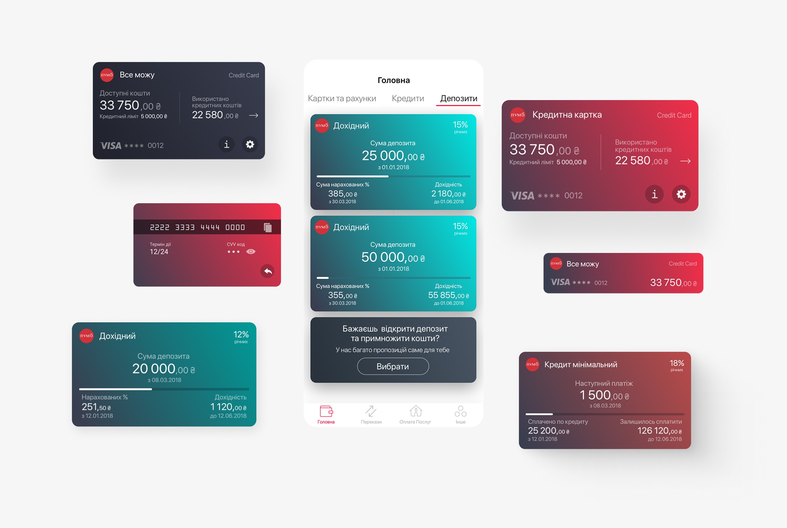
01
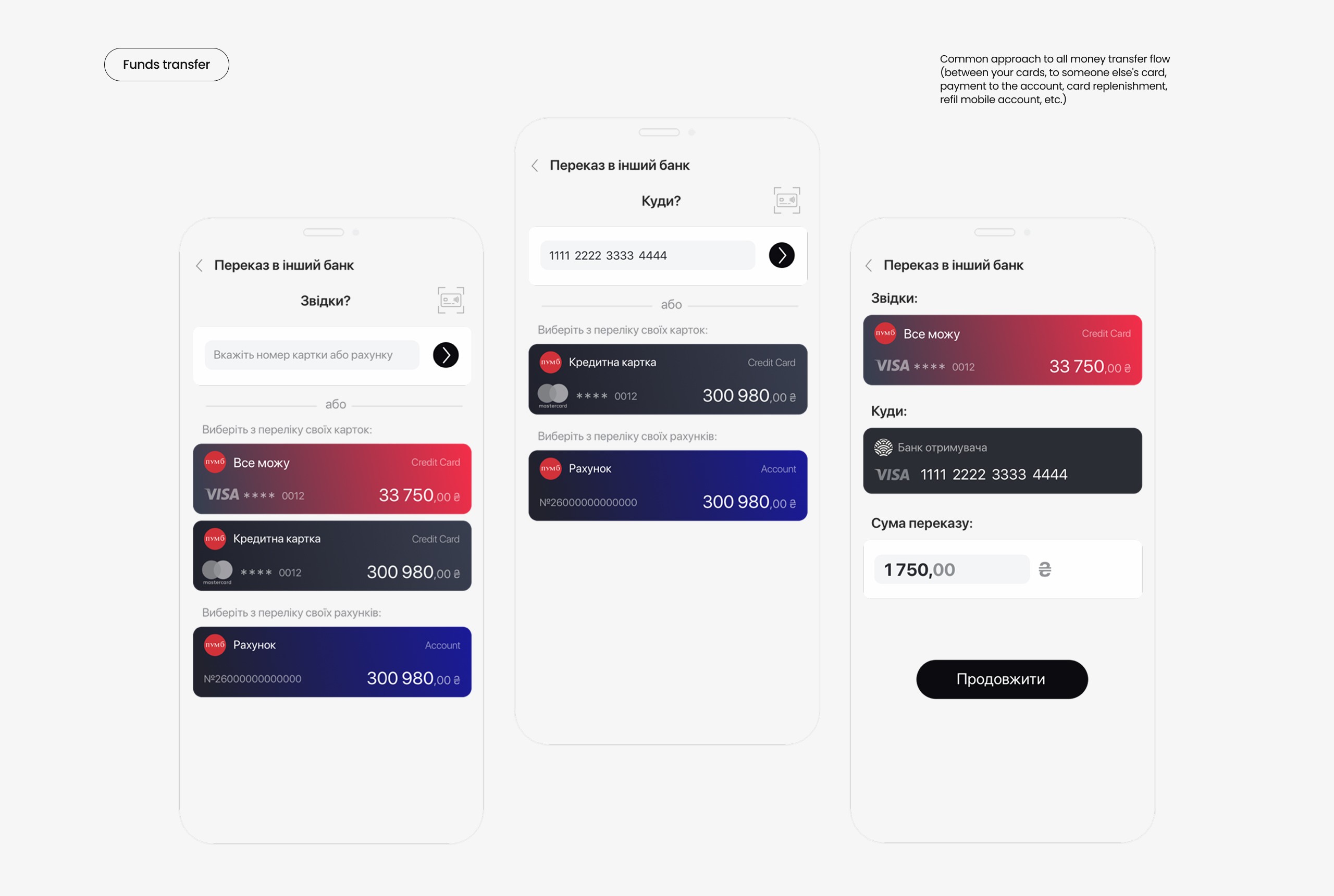
Streamlined flows for card-to-card, account, and bank transfers — fast entry, clear limits, and effortless confirmation.
02
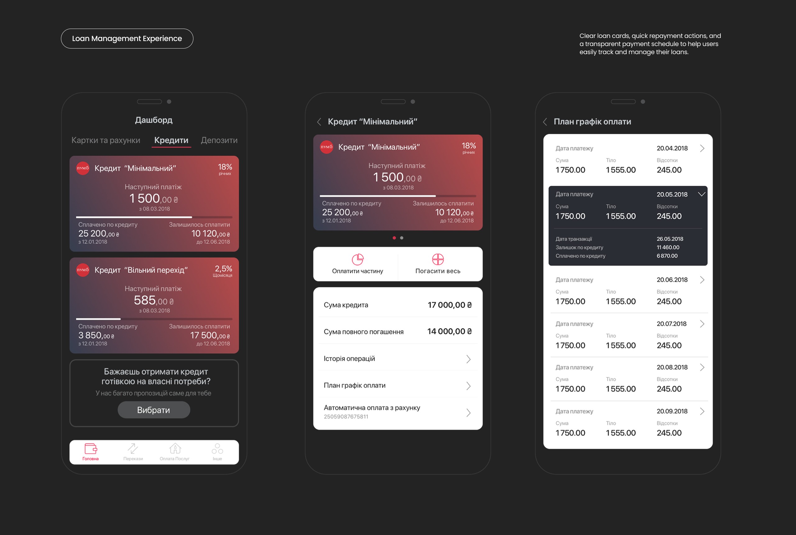
A streamlined loan management flow designed to help users clearly understand their repayment status, upcoming payments, and full payoff options. The interface presents loan cards with key metrics upfront, provides easy access to partial or full repayment actions, and visualizes the full payment schedule for transparency and financial control.
03
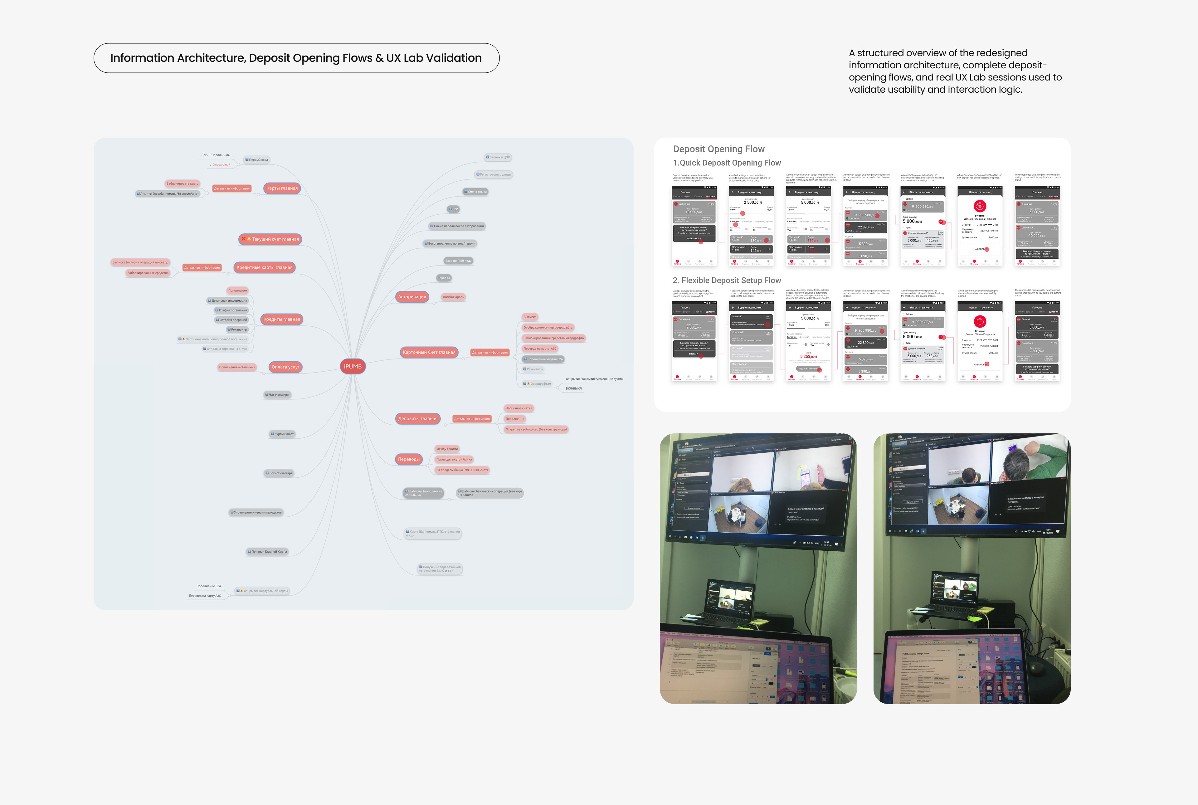
This section combines the redesigned information architecture, two versions of the deposit-opening flow (quick and fully configurable), and real UX Lab footage demonstrating how these solutions were validated with users. The mind map outlines the full functional landscape of the legacy banking app, helping reorganize product complexity into a more intuitive structure.
see also


